Global Brand Guidelines


Introduction

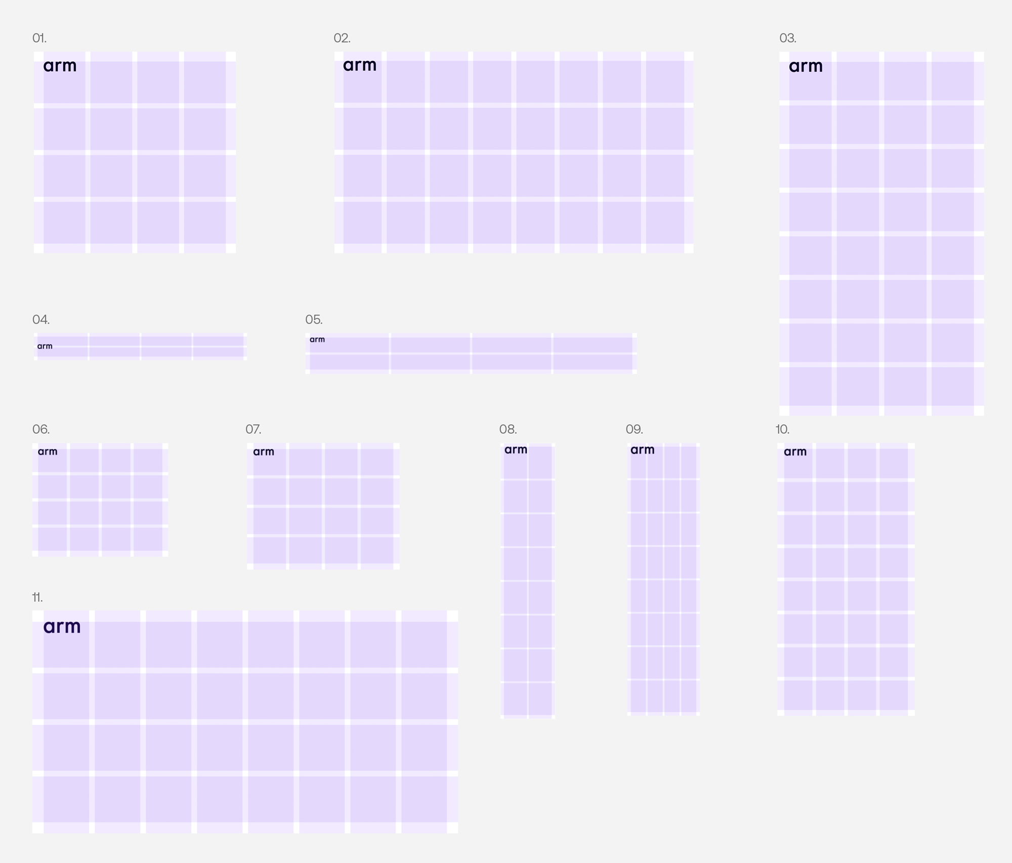
These guidelines provide a flexible design system that can accommodate any creative application of the Arm brand across a range of visual expressions. The system presents creative possibilities and works across all media, while maintaining brand consistency and recognition across every touchpoint.

With a flexible approach to distinct visual elements, the Arm brand comes alive showcasing our innovative technology, our commitment to our partner ecosystem, and our vision of a future built by the greatest technology ecosystem in the world. A future of new horizons and endless possibilities.

Building the future of computing on Arm. Together. For everyone.

Strategy

North Star

Building the Future of Computing on Arm.

Together. For Everyone.

Positioning Statement

Arm is the industry’s most power-efficient and highest-performing compute platform, with unmatched scalability that touches 100 percent of the connected global population.

Arm fuels the world’s largest software ecosystem, comprising more than 20 million developers and giving Arm the broadest software support of any compute platform ever invented. Our innovative, advanced compute subsystems (CSS) for multiple markets are enabling our ecosystem to build SoCs with more simplicity and faster time to market.

The world’s biggest technology companies, including AWS, Microsoft, Google, NVIDIA, and Samsung, are innovating on the Arm platform for their most advanced compute solutions—all with a shared purpose of meeting the insatiable demand for more compute and power efficiency to unleash the unprecedented capabilities and experiences that AI promises. The future of AI is built on the Arm platform.

Arm is the AI platform for everyone.

Brand Strategy
Framework

Brand Strategy
Pillars

Our Five Foundational Strategic Pillars


Brand Strategy
Values

We are guided by four key values.

Verbal Identity

Verbal Identity
Brand Voice and Tone

Brand voice is important because it establishes consistency and reinforces brand positioning at every touch point—advertising, PR, sales materials, online content, internal newsletters, and others.

Important Note: We are modern, innovative, and bold, yet earnest.
We are also anchored in roots that propelled the mobile computing revolution a quarter of a century ago with Arm-based chips. Now, 225 billion chips later, Arm technology is everywhere, defining the future of computing. A future built by the greatest technology ecosystem in the world. A future built on Arm.

Verbal Identity
Brand Voice and Tone

The Arm voice is based on these four values: Intellect, Collaboration, Leadership, Trustworthiness

The Arm voice should always reflect these key traits and characteristics:

Visual Identity

Design Approach
The Rationale

The Arm brand visual identity is the premium expression of our commitment to leading, global innovation and AI thought leadership that creates possibilities for unique experiences for everyone.

At the heart of our new visual identity is the Arm Horizon Arc. This mnemonic graphic device represents everything that pushes the boundaries of possibility to build a brighter future.

Our design approach is minimalist, modern, elegant, and sophisticated. Less is more. This means that every detail is considered and crafted, from the use of color and gradients, to grids, imagery, iconography, typography, and layout.

We believe that the future of computing is built on Arm. Our brand identity ensures that it’s a beautiful, distinct, and recognizable one.

Visual Identity
Look and Feel

Our visual identity is built using the following assets:

  1. Logo
  2. Color palette
  3. Brand gradients
  4. Horizon graphic devices
  5. Typography
  6. Photography
  7. Iconography

Color

Color
Palette Overview

Our colors help articulate the dimensions of our brand identity. Neutral and cool colors can reference premium technology, while the vibrant warm colors can evoke energy and inspiration.

Color
Primary Colors

Our core palette consists of Arm Ink, supported by Dark Gray, Light Gray and Silicon White. Our brand is centred around these colors in order to establish a premium brand aesthetic and to maintain brand equity. Please note that Arm Ink and Silicon White should always be the hero colors, supported by the grays.


These colors have been optimized for both digital and print – each color includes the RGB and HEX codes for digital, with CMYK and PMS color values for print. Please keep in mind the differences between color gamuts and color usability across media, and do not cross CMYK and RGB colors.

Color
Secondary Colors

Please note that Arm Ink and Silicon White should always be the hero colors, supported by the grays.

Our secondary colors bring color to imagery, gradients and infographics. These should be used in order to provide emphasis on details, and to assist in creating flexibility among our brand assets.

Color
Tertiary Colors

Our tertiary colors are to be used sparingly as an extended brand palette for detail work such as infographics and technical diagrams.

Color
Swatches

Arm Ink
HEX: #080225
RGB: 8, 2, 37
CMYK: 87 83 53 75
PMS: 296 C
Dark Gray
HEX: #6F6F6F
RGB: 111, 111, 111
CMYK: 49 40 38 0
PMS: Cool Gray 8 C
Light Gray
HEX: #F3F3F3
RGB: 243, 243, 243
CMYK: 10 5 5 0
PMS: Cool Gray 1 C
Silicon White
HEX: #FFFFFF
RGB: 255, 255, 255
CMYK: 0 0 0 0
Future Violet
HEX: #7233F7
RGB: 114 51 247
CMYK: 67 80 0 0
PMS: 266 C
Electric Teal
HEX: #02EAEA
RGB: 2 234 234
CMYK: 78 0 20 0
PMS: 319 C
Horizon Blue
HEX: #0057FF
RGB: 0 87 255
CMYK: 100 65 0 0
PMS: 285 C
Spark Orange
HEX: #F26419
RGB: 242 100 25
CMYK: 0 72 99 0
PMS: 1585 C
Vivid Yellow
HEX: #FFAE2D
RGB: 255 174 45
CMYK: 0 32 85 0
PMS: 136 C

Color
Extended Palette

The following palette shows the wide breadth of our brand colors, offering tints to be used when needed for additional accessibility needs.

Color
Accessibility

Accessibility is of paramount importance to our digital content. We have made every effort to ensure that the color combinations used are of the highest contrast and therefore legible in the digital space.

Color
Example

This page showcases how color can be used successfully to add hierarchy to content and enforce brand awareness. When used correctly and in-keeping with the accessibility rules outlined in this document, color can be an asset strong enough to stand alone whilst remaining inherently Arm in look and feel.

Color
Night Gradient

Based around the concept of a new Horizon, the night gradient is one of our primary/hero gradients. Built on a mesh (using downloadable asset), our Night Gradient is formed from our brand colors and brings dynamism and motion into the brand palette.

Color
Cropping

The range of colors and details within our gradients make them incredibly diverse and flexible. The hero gradients don’t always have to appear in their enormity, instead – as detailed here – they can be cropped and manipulated to form a series of other gradients all spanning from the master gradient block.

Color
Primary Gradients

Whether used to support infographics, backdrop imagery or add depth to blocks of copy, this page outlines some best in class examples using our primary gradients.

Color
Gradient Mesh

Our hero gradients are formed using a gradient mesh. Utilizing a mesh gradient allows us to create a smooth transition between colors in an object, ultimately creating a series of gradients that are dynamic, fluid and ownable to Arm.

Below the gradient mesh window documents the presets used for creating a mesh gradient such as this one.

Color
Day Gradient

Based around the concept of a new Horizon, the Day Gradient is one of our primary/hero gradients. Built on a mesh (see Night Gradient asset above), our Day Gradient is formed from our brand colors and brings dynamism and motion into the brand palette.

Color
Cropping

The range of colors and details within our gradients make them incredibly diverse and flexible. The hero gradients don’t always have to appear in their enormity, instead – as detailed here – they can be cropped and manipulated to form a series of other gradients all spanning from the master gradient block.

Color
Secondary Gradients

Whether used to support infographics, backdrop imagery or add depth to blocks of copy, this page outlines some best in class examples using our secondary gradients.

Color
Gradient Mesh

Our hero gradients are formed using a gradient mesh. Utilizing a mesh gradient allows us to create a smooth transition between colors in an object, ultimately creating a series of gradients that are dynamic, fluid and ownable to Arm.

Below the gradient mesh window documents the presets used for creating a mesh gradient such as this one.

Color
UI Gradients

Alongside our hero gradients, we have a more extensive set of brand gradients that can be utilized across UI elements and digital applications. Unlike our hero mesh gradients, the UI gradients are linear and formed from only two of our core brand colors.

Color
UI Gradients

When used in a digital space, our brand gradients can be utilized to add hierarchy and detailed flourish to elements. Whether bounding boxes for CTA’s or highlighting key words and phrases, our gradients can add a sense of hierarchy and improve brand awareness across digital first assets and UI elements.

Grids

Grid Systems
Principles

We have formula principles for creating our grid system.

The margin size is 5% of the shortest dimension of the format.

Grid Systems
Principles

We have formula principles for creating our grid system.

Our grid layout features four or eight columns, providing versatile options for layouts.

The gutters should be half the size of the margins.

Grid Systems
Principles

Applying content

Our grid layout features four or eight rows, and these are set as our base guide. They can be flexible when applying typography, providing versatile options for layouts.

Grid Systems
Construction
Digital Formats

We have outlined some suggested grids based on common digital formats.

1. Social Post
1080x1080px, Margin 54, Gutter 27, Grid: 4x

2. Digital Landscape
1920x1080px, Margin 54, Gutter 27 Grid: 8×4

3. Social Story
1080x1920px, Margin 54, Gutter 27, Grid: 4×8

4. Banner Ad
468x60px, Margin 8, Gutter 4 Grid: 4×2

5. Leaderboard Ad
728x90px, Margin 10, Gutter 5 Grid: 4×2

6. Medium Rectangle Ad
300x250px, Margin 13, Gutter 7 Grid: 4×4

7. Large Rectangle Ad
336x280px, Margin 14, Gutter 7, Grid: 4×4

8. Skyscraper Ad
120x600px, Margin 8, Gutter 4, Grid: 2×82

9. Wide Skyscraper Ad
160x600px, Margin 8, Gutter 4 Grid: 4×8

10. Halfpage Ad
300x600px, Margin 15, Gutter 8 Grid: 4×8

11. Social Card
1200x628px, Margin 32, Gutter 16 Grid: 8×4

The Horizon

The Horizon Arc
Rationale

The Arm Horizon is our hero graphic device that represents Arm’s philosophy and strategy.

It represents that Arm is at the edge of technology creating new Horizons and possibilities. Arm is pervasive and global, and for everyone.

The Horizon is created using this grid, allowing for a flexible, yet consistent and recognizable brand asset.

The Horizon Arc
Rationale

There are two core versions of the Horizon Arc:

1. New Horizons
2. Perspective

The Horizon Arc
Rationale

The Arm Horizon built from a globe is our hero graphic device that represents Arm’s philosophy and strategy.

It represents that Arm is at the edge of technology creating new Horizons and possibilities. Arm is pervasive and global, and for everyone.

The Horizon is created using this grid, allowing for a flexible, yet consistent and recognizable brand asset.

The Horizon Arc
Construction

There are multiple ways that we can crop into the Arm Globe that allows us to create different Horizontal Arc elements. Here are some examples of how the Globe can be used as hero graphics.

The Horizon Arc
Construction

There are multiple ways that we can crop into the Arm Globe that allows us to create different Horizontal Arc elements. Here are some examples of how the Globe can be used as hero graphics.

Primary Horizon Arc

Secondary Horizon Arc

Variations

New Horizons
Variations
Dark Mode

Our New Horizons Arc can be illustrated in four different ways. These have been shown below as a reference, please use our artworked final files available to download here.

New Horizons
Variations
Light Mode

Our New Horizons Arc is also available in light mode. These have been using the same four different ways. These have been shown below as a reference, please use our artworked final files available to download here.

New Horizons
Construction

Please follow these steps to create layouts utilizing our Horizon brand asset.

Step 01
Download the hero Horizon element called: Arm-Horizon_Arc_Hero_Artwork-Dark_Mode.

Step 02
Add in a suitable placeholder layout graphic.

Step 03
Take the required crop from the Horizon graphic.

Step 04
Apply the asset in place of the placeholder graphic.

Step 01
Download the hero Horizon element called: Arm-Horizon_Eclipse-Artwork.

Step 02
Add in a suitable placeholder layout graphic.

Step 03
Take the required crop from the Horizon graphic.

Step 04
Apply the asset in place of the placeholder graphic.

New Horizons
Construction

Please follow these steps to create layouts utilizing our Horizon brand asset.

Step 01
Take a crop of a circle stroke.

Step 02
Add in a suitable placeholder layout graphic.

Step 03
Apply our brand gradient to the stroke.

Step 04
Apply the asset in place of the placeholder graphic.

Step 01
Take a crop of a circle stroke.

Step 02
Add in a suitable placeholder layout graphic.

Step 03
Apply image into the cropped shape.

Step 04
Apply the asset in place of the placeholder graphic.

Layouts

The Horizon Arc
Layouts

Our hero brand Horizon has rules on where it can be placed on a canvas. Please refer back to the ‘Grids’ section. We have to apply rows to our layouts by either four or eight, depending on dimensions.

Once our rows and columns have been placed, the Horizon points must exit off of the canvas at one of these Vanishing Points. Examples have been shown here.

The Horizon Arc
Best in Class

Here are some layout examples of how the Horizon can be used in various layout structures.

  1. Whitepaper A4
  2. Whitepaper, US letter
  3. Social Card 1200x628px
  4. Social Card 1200x628px
  5. Leaderboard Ad 970x250px

The Horizon Arc
Best in Class
Cont.

Here are some layout examples of how the Horizon can be used in various layout structures.

  1. Whitepaper A4
  2. Whitepaper, US letter
  3. Social Card 1200x628px
  4. Social Card 1200x628px
  5. Leaderboard Ad 970x250px

Perspectives

The Horizon Arc
Perspectives —
Dark Mode

The Perspective New Horizons Arc is constructed using two circles. Using the negative space between two circles, we create our perspective Horizon. These have been shown here as a reference.

The Horizon Arc
Perspectives —
Flexibility

The Horizon Arc
Perspectives —
Light Mode

Our Perspective Horizons are also available in light mode, utilizing the same three variations as shown below as a reference. Please use our artworked final files available to download here.

The Perspective
Horizon
Construction

Please follow these steps to create layouts utilizing our Horizon brand asset.

Two Interlocking Circles
In its simplest form, the intersecting Horizon is two overlapping circles.

Fill and path-find
When these two circles are filled and the center path is removed, we begin to see the initial formation of our intersecting Horizon.

Crop
Finally, once cropped to the desired area of interest, the interlocking Horizon remains of which can be utilized across all partner assets.

Partner Horizon – Stroke
The Partner Horizon can be used in two ways, the first is as a stroke.

Partner Horizon – Color
The second use case is as a block color form, by filling the paths with the brand gradients, a sense of dynamism and fluidity can be achieved.

The Perspective
Horizon Stroke
Construction

Please follow these steps to create layouts utilizing our Horizon brand asset.

Step 01
Start with a the hero Horizon stroke.

Step 02
Duplicate the Horizon asset.

Step 03
Rotate and reposition the second stroke so that it creates a cross section.

Step 04
Apply the asset in place of the placeholder graphic.

The Horizon Arc
Perspectives —
Best in Class
Cont.

Here are some layout examples of how the Horizon can be used in various layout structures.

  1. Whitepaper A4
  2. Whitepaper, US letter
  3. Social Card 1200x628px
  4. Social Card 1200x628px
  5. Leaderboard Ad 970x250px

Don’ts

The Horizon Arc
Don’ts

Here are some things to avoid when using the Horizon.

Typography

Typography
Family

Typography
Family
Aeonik

Our primary font family comes in two versions, Aeonik and Aeonik Fono, allowing variation in hierarchy and across campaigns and sub-brands.

Typography
Family
Aeonik Fono

Our primary font family comes in two versions, Aeonik and Aeonik Fono, allowing variation in hierarchy and across campaigns and sub-brands.

Typography
Hierachy

When creating branded applications, please follow this hierarchy map for what typefaces to use and where. We primarily use regular for both fonts.

Typography
Tracking

This refers to the Horizontal spacing between a range of characters that affects the overall density of a word or block of text. As a general rule, tracking should increase as type scales down in hierarchy. For headlines, please follow the below.

Typography
Horizon

As a general rule for sizing, the x-height of large headers should align with the height of the Arm logo, to give the effect of a Horizon line.

Typography
Leading and Line Height

This refers to the vertical spacing between lines of copy and affects the overall density of a block of text. Leading increases the smaller the size of the text.

Typography
Functional

Functional typography is our everyday expression. It’s clean and premium with a clear hierarchy of information to ensure ease of use across functional moments of the brand.

Typography
Text Lock-ups

A few examples on how to correctly combine title, header and body styles:

01 Header, Lead Copy, Body Copy
02 Sub-Header, Header, Body Copy
03 Sub-Header, Title, Body Copy

Typography
Do’s and Don’ts

Here are some type do’s.

Typography
Do’s and Don’ts

Here are some type dont’s.

Typography
Languages

When Aeonik is not available in other languages, please use Noto Sans in the appropriate language.

Typography
Applications

Typography
Horizon Applications

Where possible for hero applications, we should set the type in a Horizontal line. This creates an elegant and premium feel, linking back to our core idea of the Horizon line too.

Typography
System Font

When it isn’t possible to use Aeonik, please use Arial when creating documents in programs like Powerpoint and the Microsoft Suite.

Cover slide to the Powerpoint template, showing Arial in use.

Art Direction

Art Direction
Overview

Our art direction is an integral part of storytelling, depicting the impact that our brand has on people and the world. We have two tiers – the first Horizon treatment brings to life the idea of the new Horizon into our photography, creating a unique brand asset. The second tier is for more everyday use, highlighting Arm’s impact on people and the world.


01 Horizon Treatment
Using gradient overlays and backgrounds to create a sense of sophistication and cohesion among the assets, resulting in strong brand recognition.


02 Highlighting our Impact
Our secondary image style using documentary and abstract imagery to communicate the global impact Arm has across all our LoBs and technologies.

Art Direction
Hero Treatment
Dark Mode

Our Horizon treatment comes in two styles, dark and light mode.

Our dark mode treatment allows us to create assets that are dramatic and impactful, creating focal points that emphasize our technology.

Additional photography can be downloaded here.

Additional photography can be downloaded here.

Art Direction
Hero Treatment
Light Mode

Our Horizon treatment comes in two styles, dark and light mode.

Light mode is used to create a feeling of aspiration and cleanliness. This allows us to create assets that feel premium and sophisticated.

Art Direction
Hero Treatment
Principles

When creating Horizon imagery, ensure that you are keeping within these style principles in order to create a library of images that are cohesive, and build brand recognition.

Isolated Imagery
Choose images that are isolated with clear backgrounds. Light colors for light mode, or dark for dark mode. This creates a clean, premium aesthetic, and is more successful when applying the gradient backgrounds and overlay effects.

Horizons
Look for details and edges that can be cropped into to create Horizon lines within the imagery. This builds a layered and considered brand, and brings all our visual language back to the idea of the new Horizon. Crop into details to avoid recognizable products of specific brands.

Dynamic Angles
Look for dynamic angles, so that the subject feels like it’s in motion and not static. Rotate and crop imagery as needed to create a more dynamic feel to the layout.

Color
Choose imagery that already has our brand colors in. This will make it far more harmonious when the treatment is applied.

Adding Humanity
Add people imagery where possible. This shows that Arm is human centered, building the future for everyone.

Art Direction
Hero Treatment
Horizon

We can also use the various Horizon graphic devices behind imagery that has our hero treatment applied where appropriate.

Art Direction
Hero Treatment
Dark Mode
Applying Effect

The image treatment is created in Adobe Photoshop. Follow these step-by-step instructions to create new imagery.

The most important thing is to start with a good image, following the principles on the page before.

The final effect should be subtle, considered and intentional. It should feel like the subject matter has been lit in a studio.

This is a general guide. For some images such as the abstract data image where the background is busier, Step 01 can be skipped and more experimentation with color correction tools in Photoshop may be needed.

You can follow the same rules for light mode, but different blending modes may be required such as: ‘Multiply’ or ‘Overlay’.

Step 01
Select your image and cut it out in Adobe Photoshop using the various selection tools available. Mask the shape.

Step 02
Select a crop from the Night Mode Gradient and insert as a new layer to create your background.

Step 03
To create the lighting effects, choose a large paintbrush in one of the brand secondary colors. Use 0% ‘Hardness’.

Step 04
Experiment with blending modes to achieve the desired outcome. Screen and Overlay settings work well.

Step 05
Build up the layers of light effects until you have created the desired effect. You can experiment with the brush tool, masking and blending modes until you get it right.

Step 06
The final result. Please take care to achieve a good balance of brand colors.

Art Direction
Hero Treatment
Examples in Use

When creating assets using our hero imagery, we should be intentional and considered as to where they are applied.

Across both print and digital, we would use our hero imagery to create a sense of transformation and global impact. We would also use it in situations where there is a need for striking visuals as opposed to supporting copy. Advertising and technical document covers would be an ideal application for our hero imagery.

Art Direction
Hero Treatment
Don’ts

Always protect the integrity of the brand by following the rules stated previously, and avoid any of the common mistakes that feature on this page.

Typography
Impact Imagery
Style Principles

Our secondary photography depicts what Arm does, from processors to devices, The choice of imagery used is imperative to building brand recognition, and when choosing imagery, you should consider the following principles to create a library of cohesive and appropriate imagery.

Close-up Shots
Create a premium feel that emphasizes the product aspect of the brand. These should mostly be on a flat color background or with a gradient background.

People-focussed
We add humanity where possible, interacting with our products and devices.

We choose images that show our global nature, showing diversity and showing how technology is for everyone.

Abstract
Depicting subject matters such as data centers and AI in a visually engaging and interesting way.

Pervasive
Showing our impact in the world – and showing the nature that inspires us. This demonstrates our global outlook.

Color, Light and Horizons
We choose images that complement our color palette. We should choose imagery that features dramatic lighting or horizons where possible to emphasize our brand idea and make our image library unique to Arm.

Art Direction
Impact Imagery
Color

Images should be chosen with colors that fit the Arm color palette. This creates a sophisticated, ownable and cohesive feel to our art direction. Images can be recolored if needed.

Art Direction
Impact Imagery
People and Devices

Technology is, after all, here to benefit us. This category should feature the end-benefit of the technology that Arm provides, either directly or indirectly within our partners products.

These photographs should signal the emotional aspects of those products and devices.

This style can be diverse, yet should always focus on people rather than on the hardware.

Art Direction
Impact Imagery
LoBs—Clients

These images show how we apply our art direction principles to Client imagery – showing consumer devices. As these products are focused on consumer products, we also show people where possible.

Art Direction
Impact Imagery
LoBs—Automotive

These images show how we apply our art direction principles to Automotive imagery.

We must avoid the use of 3D stock renders of conceptual cars.

Art Direction
Impact Imagery
LoBs—Infrastructure

These images show how we apply our art direction principles to Infrastructure imagery.

We can use more abstract imagery here to show the idea of a data center when we need impact.

Art Direction
Impact Imagery
LoBs—IoT

These images show how we apply our art direction principles to IoT imagery.

Art Direction
Impact Imagery
Technology Driven

As the architect of processor computing, we continue to expand into new, emerging technologies that improve the way we live.

As we look towards becoming a Silicon company, images of processors will be a key part of our visual toolkit.

Crops with focal blur work well for these images.

Art Direction
Impact Imagery
Global Impact—Expansive

Arm technology is ubiquitous, from smartphones to supercomputers, from medical instruments to agricultural sensors, and from base stations to servers. Arm technology is used by everyone, anywhere, at any given moment in time.

Expansive photography helps illustrate the scope of technology transforming the daily experience of modern life. Use expansive imagery to convey the idea that Arm is everywhere.

Art Direction
Impact Imagery
Global Impact—Aerial

Aerial photography emphasizes the repetitive patterns of objects or places, in nature or in man- made environments. When selecting aerial photography, consider the overall pattern, and if the visual connotations help support the messaging.

Art Direction
Impact Imagery
Abstract Imagery
Data

Abstract technology and data photography are used to represent the Arm ecosystem, digital computing, or data flow and process. Abstract images are also used as background textures to support key messages. When selecting abstract images, consider contrast and color, and if it requires typography to be overlaid for legibility.

Art Direction
Impact Imagery
Abstract Imagery
AI

To illustrate that Arm is the AI platform for everyone, we can use abstract interpretations of AI.

Circular shapes link back to the Arm Horizon, and repetitive shapes hint at the way AI processes data.

AI images must be chosen carefully in order to avoid cliché images such as brains and neural networks.

Art Direction
Impact Imagery
Global Impact—Horizon Arc

Where possible, we use shots of products, nature or abstract textures that utilize the Horizontal Arc shape to create a curated, unique set of visuals.

These should follow the layout principles set out in the Horizontal Arc section of the guidelines.

Art Direction
Impact Imagery
Recoloring Imagery

It is not always possible to source the perfect image that strikes the right tone for specific applications. In these instances, it is important to manipulate the image to ensure it feels appropriate to the brand collateral. Below documents how we can recolor images by simply adjusting the hue and saturation within the image color channels.

Image, Adjustments, Hue/Saturation
After opening the image in Adobe Photoshop, go to the ‘Hue/Saturation’ drop down in the image menu. Alternatively hit cmd + U.

The ‘Hue/Saturation’ pop-up tab should then appear center screen. Be sure to tick the preview box in the bottom left of the window, before making any adjustments as this will allow you to see the alterations happening in live time.

Select the appropriate color channel
From the drop-down select the color channel you want to replace. Multiple channels can be edited, however, they must be done one by one.

Adjust the sliders accordingly
Adjusting the ‘Hue’ slider will adjust is the color itself, whilst the ‘Saturation’ slider is a measure of how strong or pure that color is. Once the desired outcome has been achieved, hit ‘OK’.

Art Direction
Impact Imagery
Recoloring Imagery

Before

After

Iconography

Iconography
Library

An icon is a functional tool, not a decorative element. By itself, an icon acts as visual shorthand to quickly and clearly convey an idea, a feature, or a benefit. When combined with text or other data, an icon enriches storytelling.

Inspired by our distinctive brand attributes, our icons are simple, approachable, and refreshingly human.

Arm icon attributes:
– Purposeful
– Singular concept
– Legible
– Minimal detail
– Consistent line weight.

Grid and Construction
Overview

Our iconography system is crafted with a combination of a 20×20 grid and the ‘Arm Horizon’ grid. Be sure to always design your icons based upon this grid.

Also provided in the diagram to the right is an example of clear space around each glyph, as well as key-lines that should be used to align shapes.

For Horizontally proportioned icons, ensure they align with the provided Horizontal keylines. Similarly, for vertically proportioned icons, align your shapes with the vertical keylines to maintain consistent proportions and visual balance.

Example of the 20×20 grid units, keylines and margins. Along with guidance on iconography point spacing.

Grid and Construction
Overview

The template allows for some creative freedom within the grid. With the flexibility of using both the Horizontal Arc lines and the core icon grid to build components. Here is an example of how icons can be created using sections of the template.

Where possible, each icon should have at least one element that is taken from the Arm Horizon grid.

By using both the Arc lines with the icon grid, we create four that can be repositioned to create the desired icon.

With some small design edits, we achieve our icon.

Color examples in light and dark modes.

Iconography
Color Variations

Our icon system is designed to work across our color spectrum. Icons may be rendered in any color from our brand palette. In majority of cases iconography should utilize only one color per icon.

Iconography
Horizon Tier

In select cases, our icons can also have added brand personality by applying Horizon Blue to an individual stroke. These can only be placed in key icon Horizon strokes and should be used sparingly.

Arm Horizon as a reference of how we are applying color.

The brand gradient is applied to the icon’s Horizontal Arc stroke.

Tier Two Icons
Overview

When using Tier Two Icons, only one section of the icon should be an alternative color.

Partnerships

Partnerships Logo Lock-up
Overview

This page outlines how the Arm logo appears when paired with an external partner logo.

Where possible, the logo lock-up should be in-keeping with our primary color combination.

Partnerships Logo Lock-up
Construction

Clear space protects our logo lock-up by giving it a minimum amount of breathing room. The minimum amount of clear space is half the height of the Arm logo. This clear space area is a recommended minimum, and should be increased whenever possible.

The height of the Arm logo, labelled x, also dictates the spacing between the Arm logo and the partner logo in this lock-up.


Partnerships Logo Lock-up
Minimum size

There is no preset maximum size for the Arm logos. Minimum sizes are as shown here.

The Arm logo should never be scaled smaller than the minimum sizes provided to maintain optimum legibility. Arm logos can be used down to a minimum width of 0.625″ in print, and 60 pixels in digital.

Logo
Color Variations


Primary Partner
Tier 01

When the partner in question is a primary or tier one level partner, we have license to introduce the partners core color into the Horizon gradient and color scheme of the collateral. In this
instance, the Aston Martin green has been leveraged to build the gradient. By using these colors with existing Arm design systems, brand recognition is retained for both brands. This guidance is used if the partner does not have their own guidance — many tier one partners will have their own rules which you must adhere to and in particular for the logo.

Secondary Partner
Tier 02

However, for secondary or tier two partners, we utilize only the only the Arm color palette and brand assets. The partner logo should be locked up in the same way, but existing solely in Arm Ink or Silicon White, with all other color injection utilized from the Arm color palette only. Solely in black or white with all color injection coming from the Arm palette.

Primary Partners
Examples in Use

When the partner is a primary or tier one level partner, we have we have license to introduce the partners core color into the Horizon gradient and color scheme of the collateral. In this instance, the Aston Martin green has been leveraged alongside the core Arm brand assets to build some best practice examples.

Applications

Application
OOH

Application
OOH

Application
Digital Screens

Application
OOH

Application
Website Landing Page

Application
Event Website Landing Page

Application
Powerpoints

Application
Whitepapers

Application
Social & Digital
Social Adverts

Application
Social & Digital
Display Adverts

Application
Events
Booths

Application
Events
Booths

Application
Events
Keynotes

Application
Events
Banners

Arm’s Trademarks

Using Arm’s Trademarks

Legal Notices

Copyright © 2025 Arm Limited.

All content featured in this document is protected under various national and international intellectual property laws, including but not limited to copyright, trademarks and designs, as well as unfair competition laws. All content featured in this document is the property of Arm Limited (or its subsidiaries) or licensed to Arm Limited (or its subsidiaries) for use by Arm under licence from one or more third parties.

The Arm trademarks featured in this document are registered trademarks or trademarks of Arm Limited (or its subsidiaries) in the US and/or elsewhere. All rights reserved. All other trademarks featured may be trademarks of their respective owners. A full list of Arm’s trademarks is available at https://www.arm.com/company/policies/trademarks.


Using Arm’s Trademarks

Arm’s trademarks are among the company’s most valuable intellectual property assets. They represent the highest standards of quality and excellence associated with Arm’s products and services.

Arm’s ability to protect its trademarks depends on proper and consistent usage. Please follow Arm’s trademark usage guidelines (available at https://www.arm.com/company/policies/trademarks) when using any Arm trademarks, including but not limited to any word mark, logo or slogan.

Contact trademarks@arm.com if you’re considering any deviation from Arm’s trademark usage guidelines before any deviation is made.

Contact trademarks@arm.com if you have any questions or feedback about Arm’s trademark usage guidelines.

Contact Details

For questions regarding the Arm brand identity, please contact:

Jonathan Armstrong

Head of Brand and Creative

m. +44 (0)7392 091642

jonathan.armstrong@arm.com


Chris Salvador

Senior Designer

m. +1 904.525.7105

chris.salvador@arm.com

Ben Webdell

Senior Visual Designer

m. +44 (0)7759 458575

ben.webdell@arm.com